Websites
increase in menu views due to improved UX
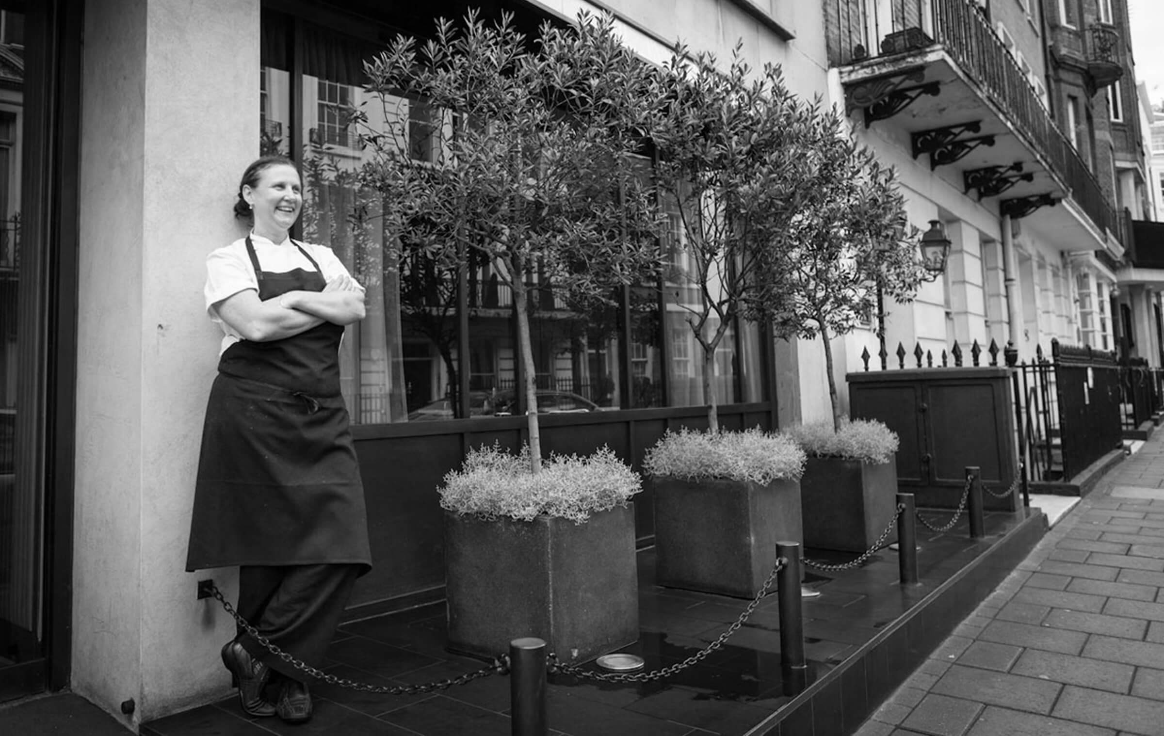
Angela Hartnett’s Italian restaurant group needed a major website design upgrade. A brand with serious style and a high profile name at the helm, it had to be flawless.
A confident design and commitment to simplicity put the product centre stage. Meticulous UX planning, using data gleaned from years of advertising for the group, ramped up conversions.
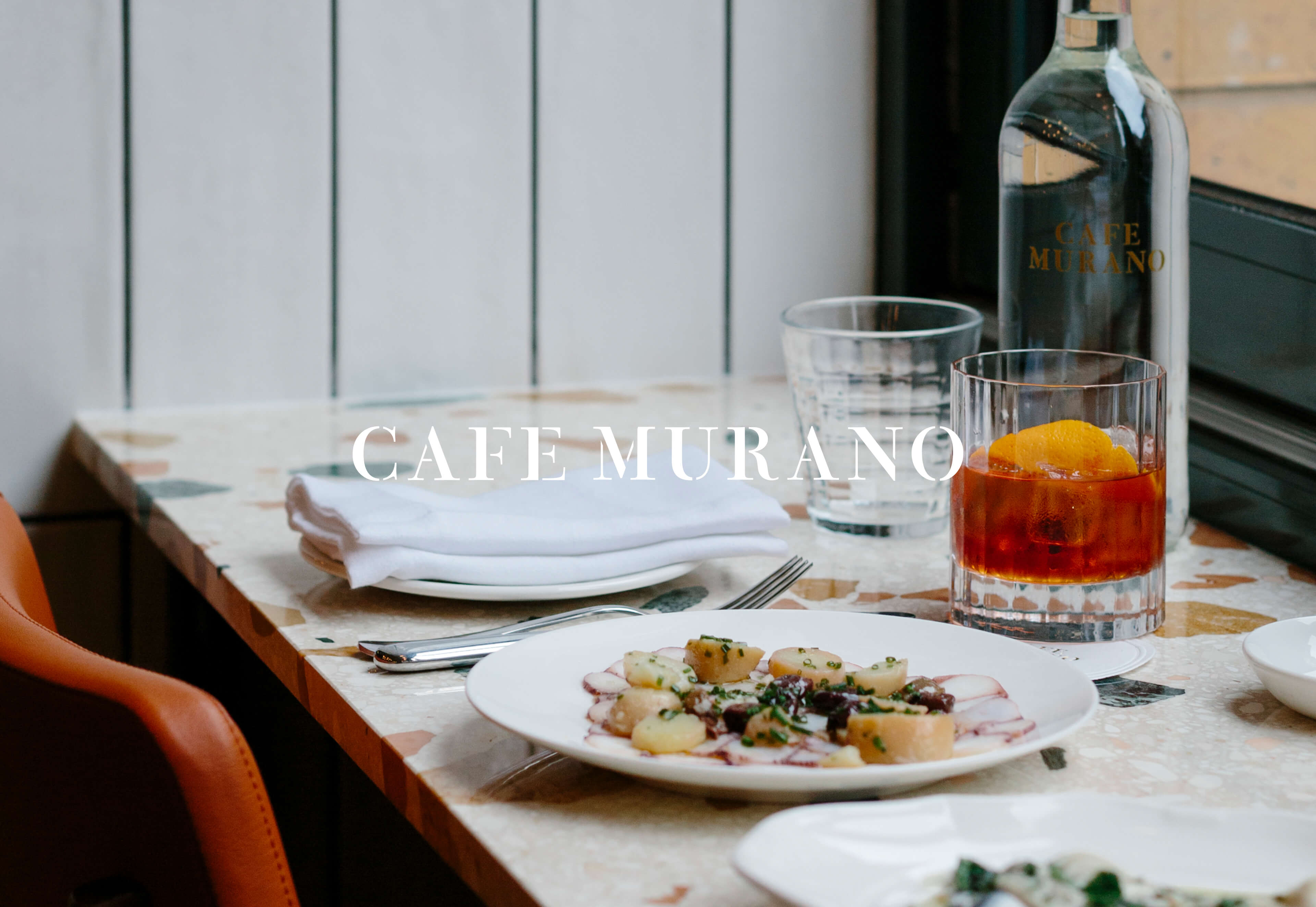
Cafe Murano is dedicated to quality & simplicity. Their rigour and commitment to sourcing only the very best ingredients from top suppliers underpins everything. We reflected this uncompromising approach by letting the ingredients, seasons and suppliers shine.
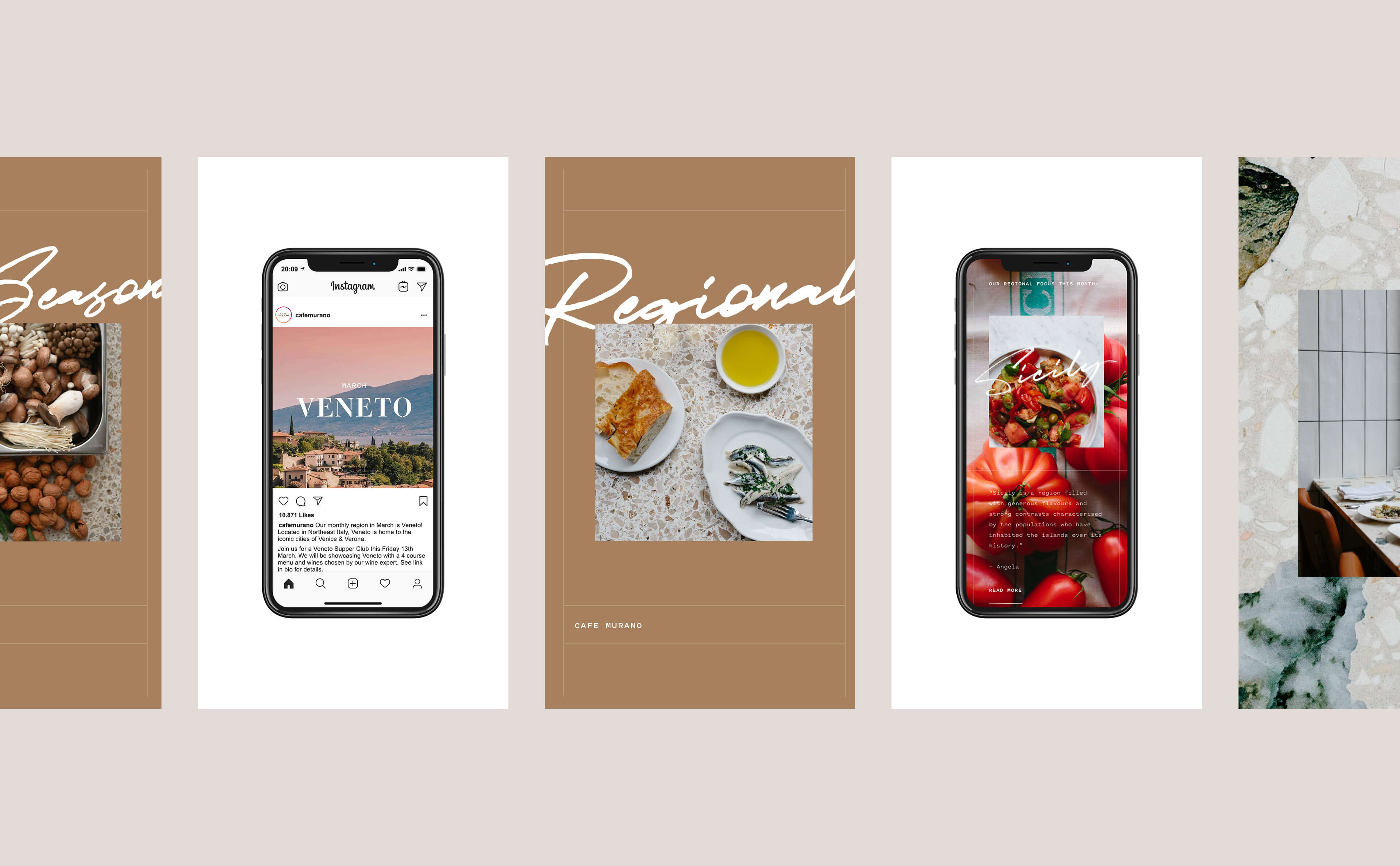
The seasonal stories at the fore of the website echo the restaurant menus and the messaging we use across social media.
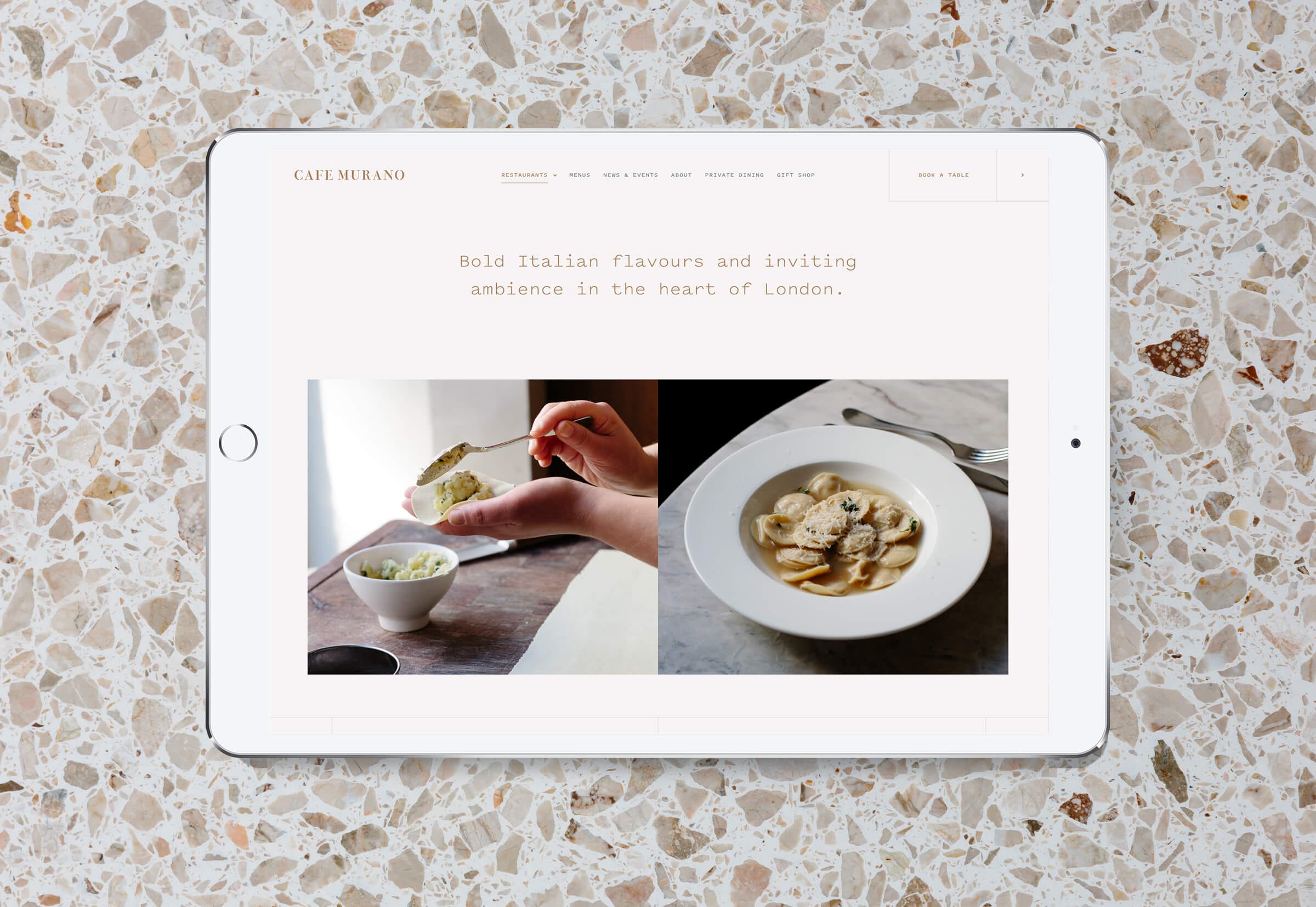
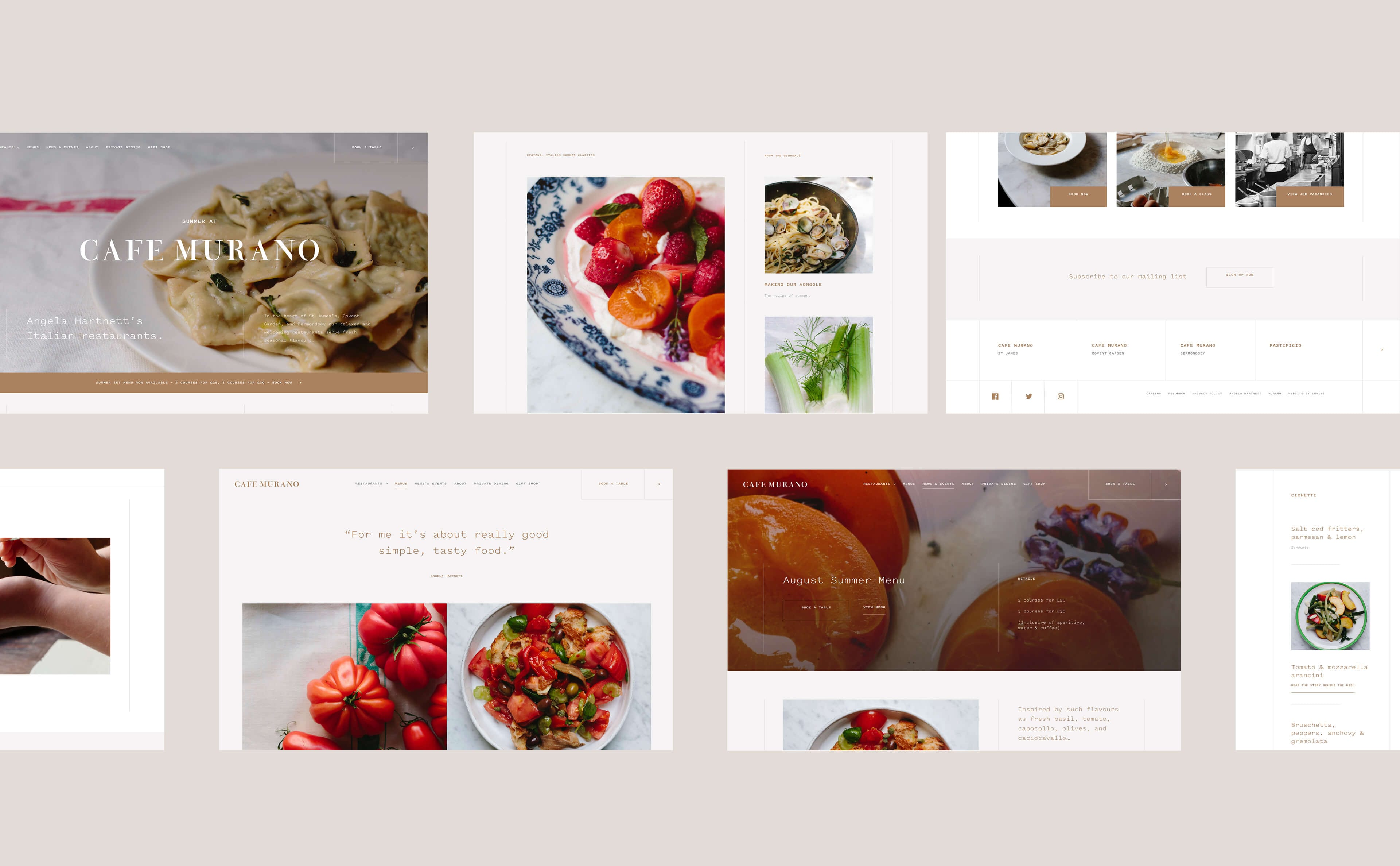
Confident use of white space and a simple layout allows the photography to take centre stage. No special effects or animations were needed - this design was an exercise in restraint. The overall effect is elegant and modern, without being austere, and lets the food do the talking.
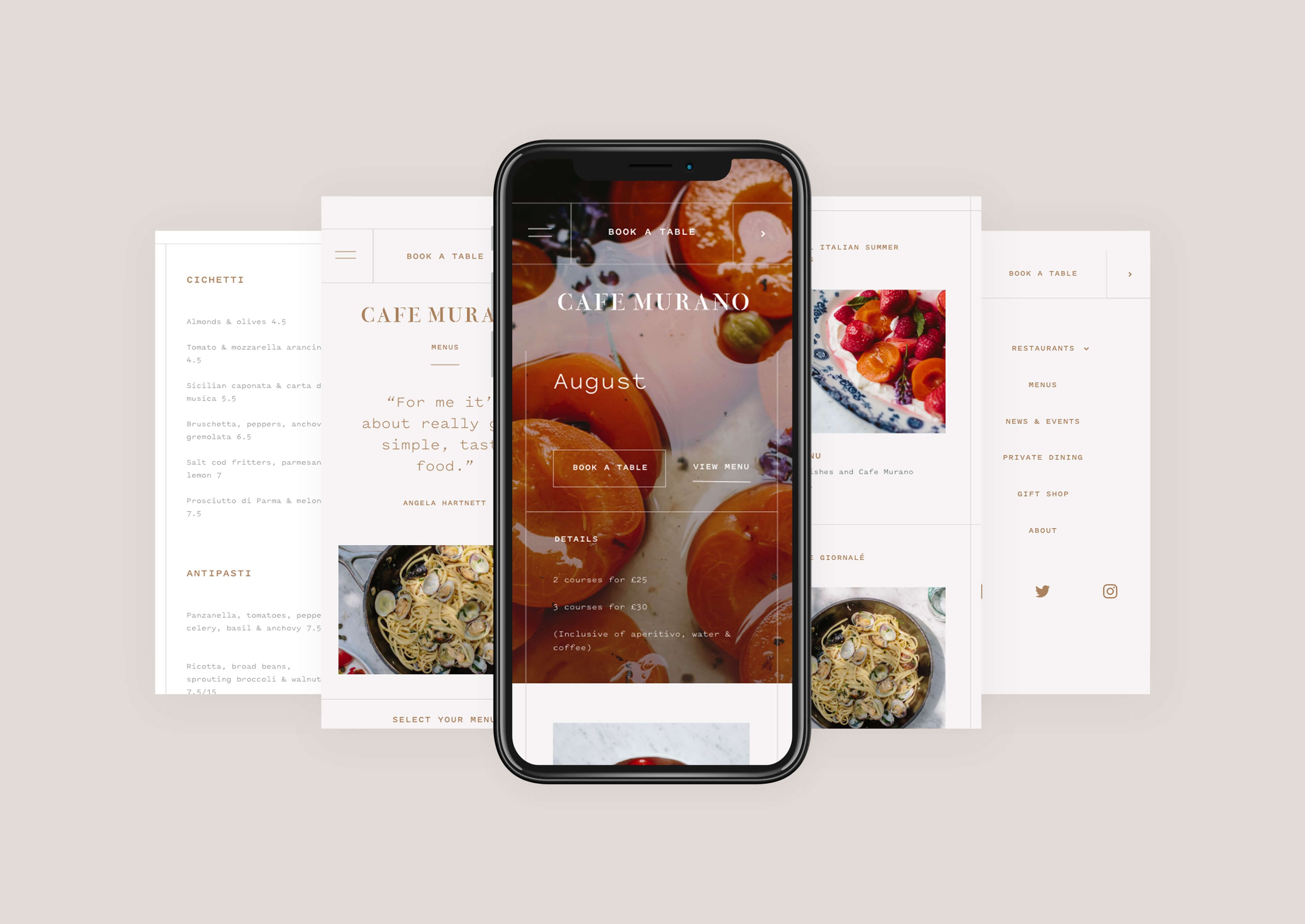
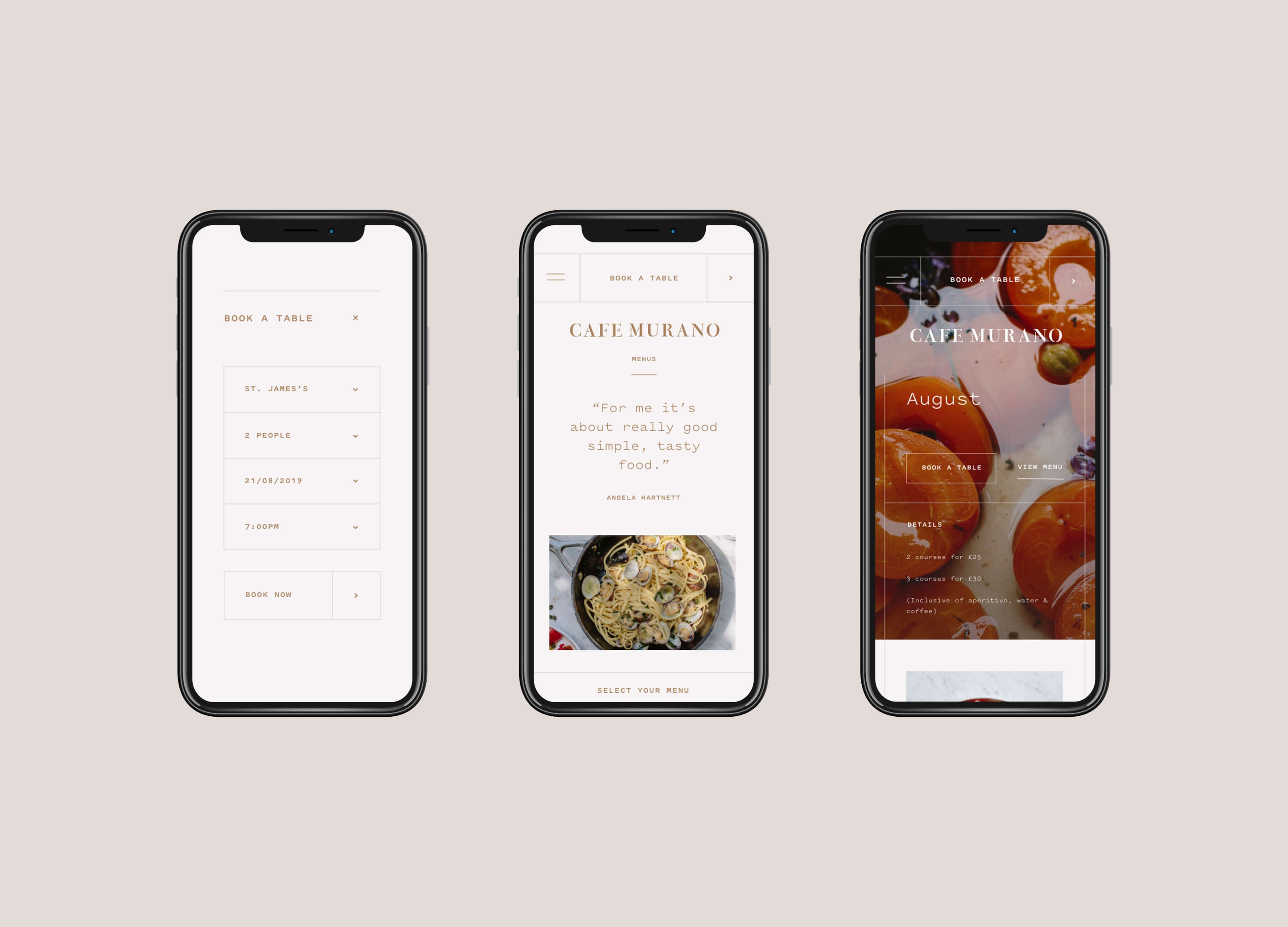
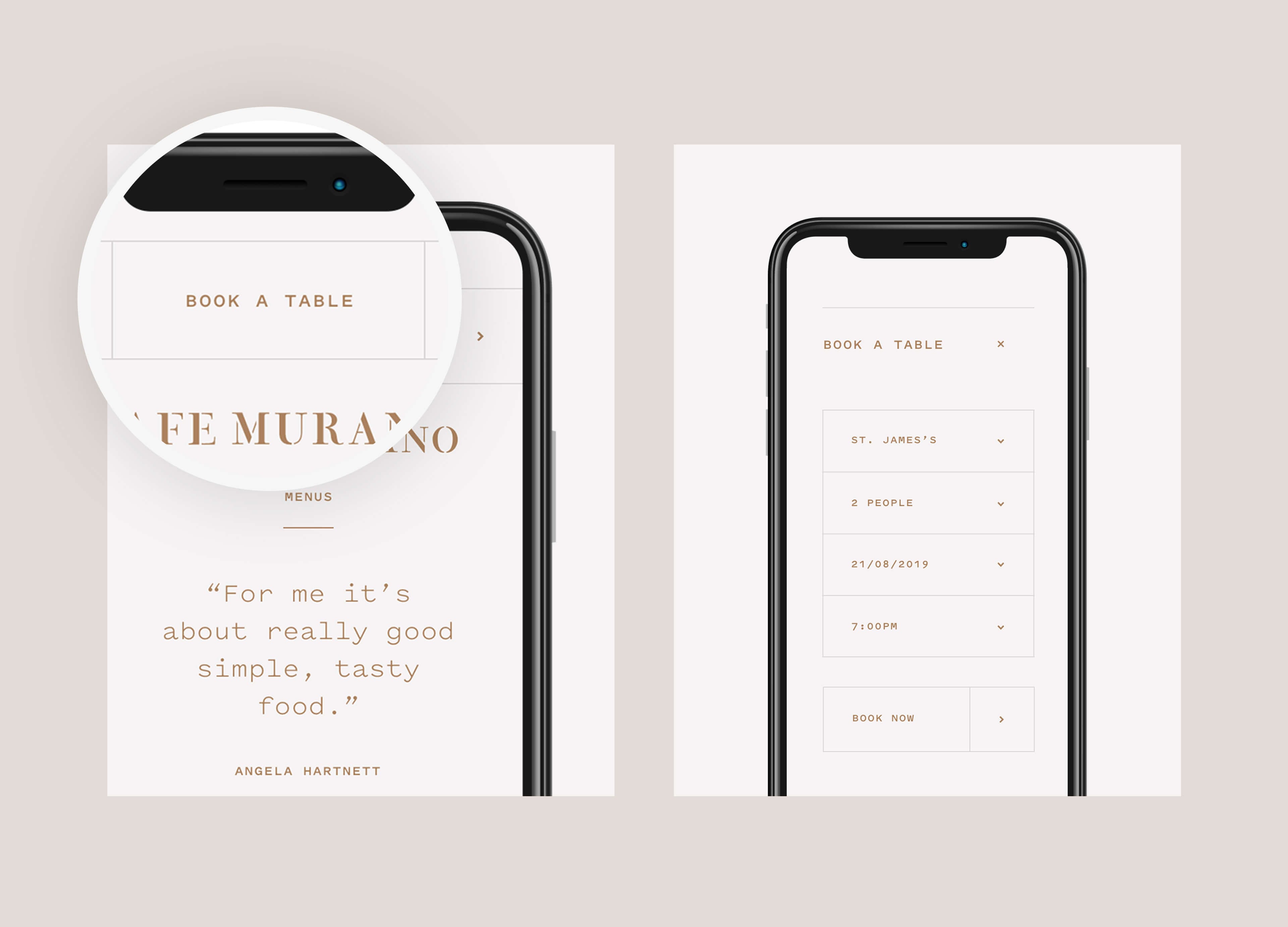
We overhauled the site structure and UX completely. After 3 years running search PPC and social advertising for the group, we knew exactly what website users wanted to find.
Creative focus, and key information were driven by data, with key actions prominent and easy to find. With a particular focus on mobile, the conversion rate increased an impressive 10%.
website conversion rate for bookings
menu views due to improved UX
organic traffic due to advanced SEO implementation
Related case studies
Pho
Rhubarb Hospitality Collective
What services are you looking for?
Please select a service
Strategy & planning
Website
Marketing
Technology solutions
Branding
CRM
Other
Tell us about your project and what you want from us, this will help us prepare for our call.
What’s your budget?
Please select a budget
Less than £10k
£10-£40k
£40k +
Your Information
Business Type
Location
Please select your location
UK
USA
Europe
Global
How did you hear about Ignite?
I've worked with you previously
Found you online
Recommended by Ignite client or collaborator
Saw an Ignite advert or social
Through Clutch
Other
Tick the box to receive insight, opinion and inspiration from Ignite Spunta la casella per ricevere la newsletter
Please note that by submitting this form you agree to us storing your contact details and contacting you in regard to your query. Our privacy policy is available on our website with full details on our commitment to protecting personal data.
We'll be in touch soon!
Your Information
Tick here if you'd like to receive insight, opinion and inspiration from Ignite Please tick to receive newsletters


Ignite have joined forces with Screen Pilot to form the world's leading marketing agency for the hospitality, travel and leisure markets.
Same team. Same world-class results. Now with more firepower - and the data to back it up.
Head over to our new site to see what’s next. Or call us on 020 7697 0151 to discuss your project.