Websites

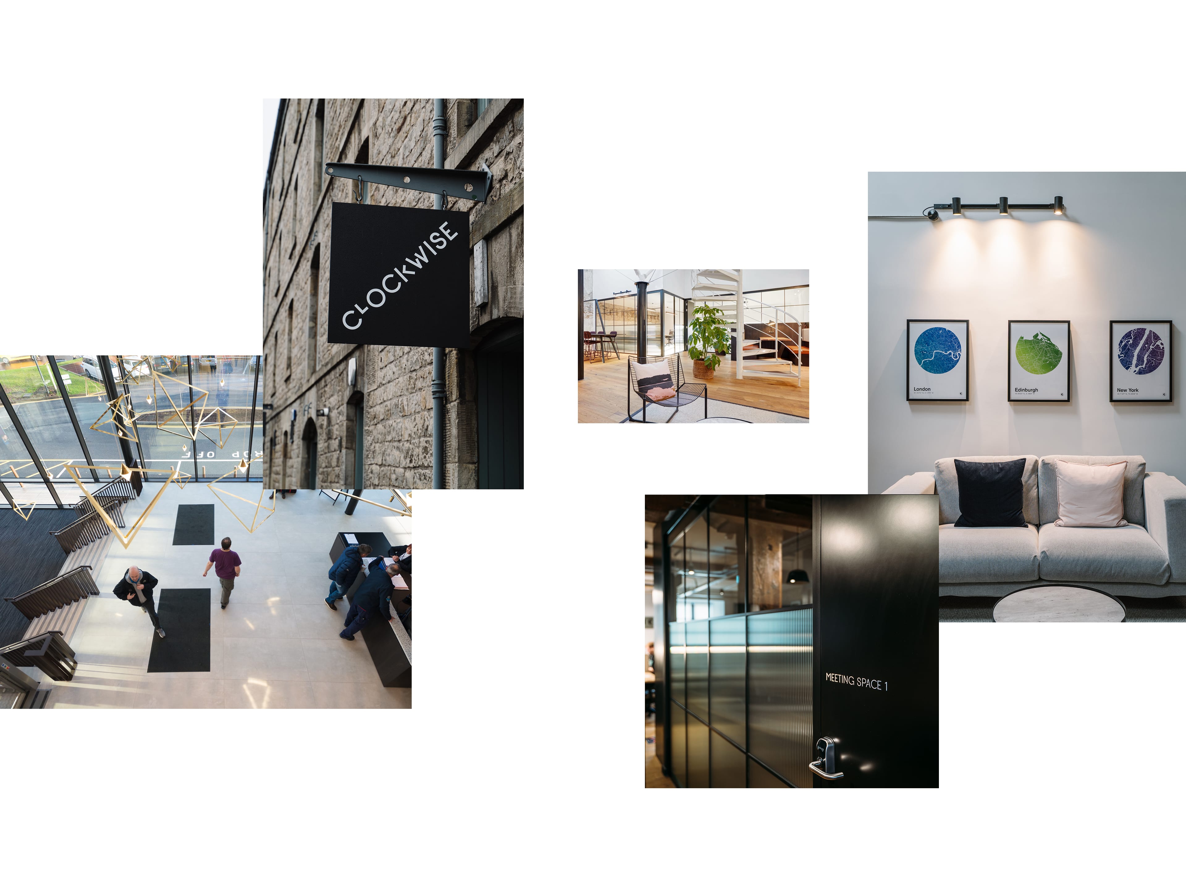
The Clockwise site leans heavily on video footage and imagery. The reasons for this are threefold. One, given the change in workplace behaviours, there was a real need to reflect what its like to step inside a Clockwise location. As viewings are less accessible, there is no better way to get this across than with video and photography. Two, video testimonials give potential customers the sense of community, collaboration and networking you get with Clockwise. Cinematography gets this across in a more personal way and puts faces to names in terms of Officer Managers. Three, Clockwise workspaces look great. With state-of-the-art technology, roof terraces and modern interior design all within iconic settings, why not showcase this in glorious technicolour.
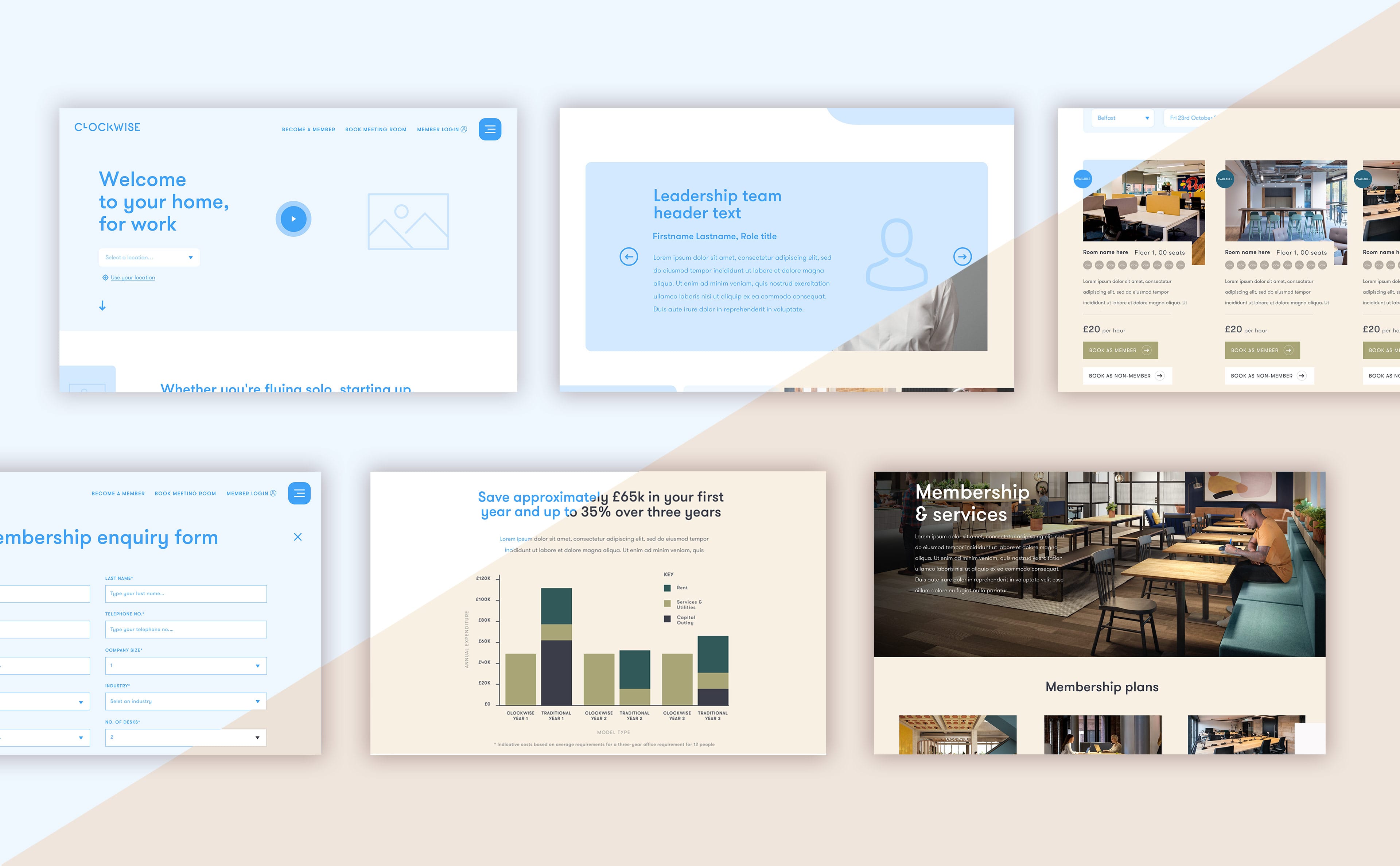
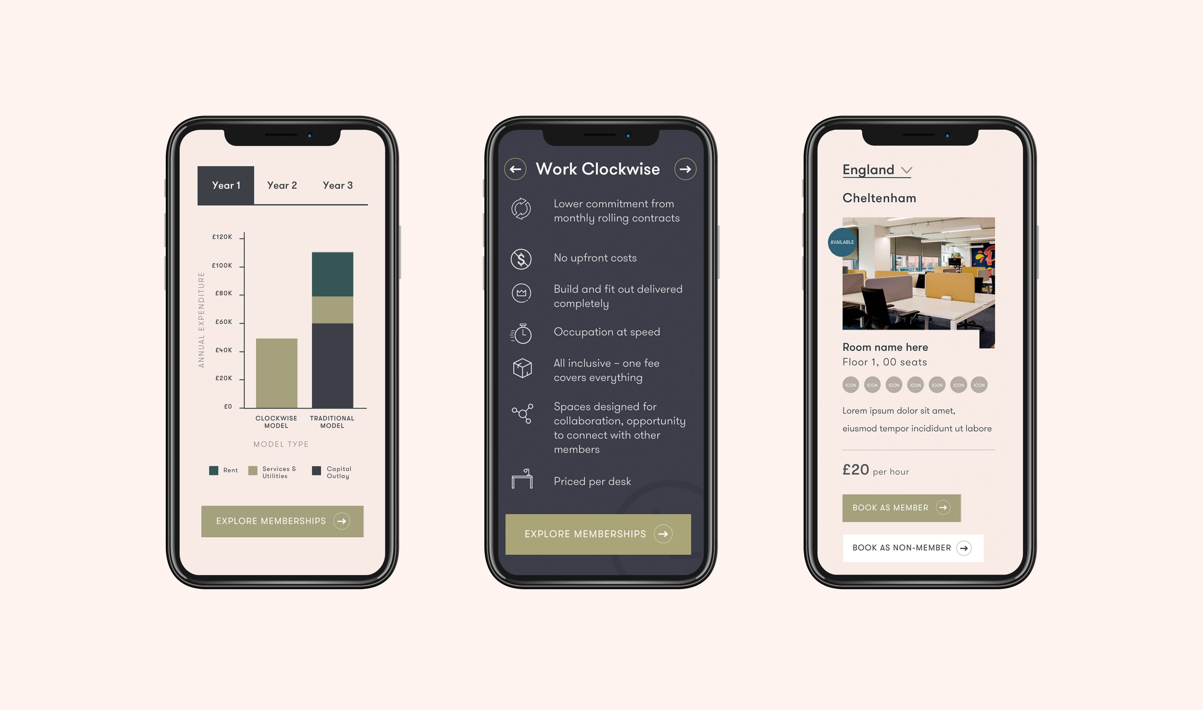
Our challenge was to design a site that communicates the benefits, services and scale of the business, whilst making filtering and navigation intuitive and easy. Clockwise is all about flexibility and choice. Resultantly, leases, membership types and services all have a wide range of options, each varying in complexity. One person looking to book a meeting room for an hour has shorter term needs than a large-scale company weighing up the benefits of a flexible two year lease. We identified the site needed three key characteristics; be informative, be easily comparable and be easy to navigate. A site boasting these attributes would allow every user journey to be simple, regardless of the complexity of it's content.
Our team spent an extensive induction with the Clockwise team to gain a true understanding of each location, service and the brand as a whole. The result was a great understand of the business. We spent time planning each user journey through wireframing. The options available throughout the site made a structured hierarchy paramount. We accounted for every location, service, membership, status and duration/complexity of a commitment.
What sets this site apart from other is that it also considers how each of these co-exist without overwhelming the user. The Clockwise site caters for those that know the who's, whats, whys and whens. However, information is formatted in a way that presents the complete offering, allowing for comparison, contemplation and ultimately conversion. Wherever a user falls within that scale, they are guaranteed a relevant, concise and smooth user journey.

Signing a lease is both a complex and financially significant commitment. Comparison is king and Clockwise's flexible offering meant that monetary savings where so sizeable that here was a real need to highlight monetary savings. We utilised numerous animated infographics, interactive comparison tools and a quote calculator to ensure information is engaging, readily available and customisable so as to fit bespoke user needs.

One interesting challenge was the locations section on the homepage. There was a need to reflect the broad, global scale of Clockwise, whilst simultaneously being able to filter to smaller areas like countries, cities and boroughs. A common struggle designers encounter is the request to include a country, continent or world map. Unfortunately, all of these are too vast to accomodate any meaningful form of navigation. Moving a user's visibility from the Europe to Earlsfield jumps too far and too fast between broad and specific to transition in a seamless manner.
Bearing that in mind, we wanted to design something that; Highlighted Clockwise's scale, was visually engaging and boasted simple, intuitive UX. The solution? Morphing vector map that filtered between countries. Each country had links to cities and boroughs. Therefore, any location was just two clicks away, regardless of the user's starting point in the world.
Related case studies
What services are you looking for?
Please select a service
Strategy & planning
Website
Marketing
Technology solutions
Branding
CRM
Other
Tell us about your project and what you want from us, this will help us prepare for our call.
What’s your budget?
Please select a budget
Less than £10k
£10-£40k
£40k +
Your Information
Business Type
Location
Please select your location
UK
USA
Europe
Global
How did you hear about Ignite?
I've worked with you previously
Found you online
Recommended by Ignite client or collaborator
Saw an Ignite advert or social
Through Clutch
Other
Tick the box to receive insight, opinion and inspiration from Ignite Spunta la casella per ricevere la newsletter
Please note that by submitting this form you agree to us storing your contact details and contacting you in regard to your query. Our privacy policy is available on our website with full details on our commitment to protecting personal data.
We'll be in touch soon!
Your Information
Tick here if you'd like to receive insight, opinion and inspiration from Ignite Please tick to receive newsletters


Ignite have joined forces with Screen Pilot to form the world's leading marketing agency for the hospitality, travel and leisure markets.
Same team. Same world-class results. Now with more firepower - and the data to back it up.
Head over to our new site to see what’s next. Or call us on 020 7697 0151 to discuss your project.