Websites
Branding & Strategy
Libby Andrews, Marketing Director, Pho
Conversion Rate
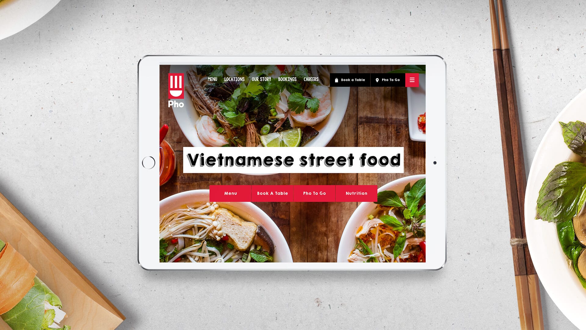
As Pho expanded across the UK, they needed a website that could match their ambitions. We were challenged to develop a site that drives bookings, reflects the independent nature of the restaurants, and brings the brand story to life.
Unlock the power of Pho’s brand with a powerful conceptual design route, combine that with meticulous UX planning and clever use of technology in a simple to use and easy to navigate site.
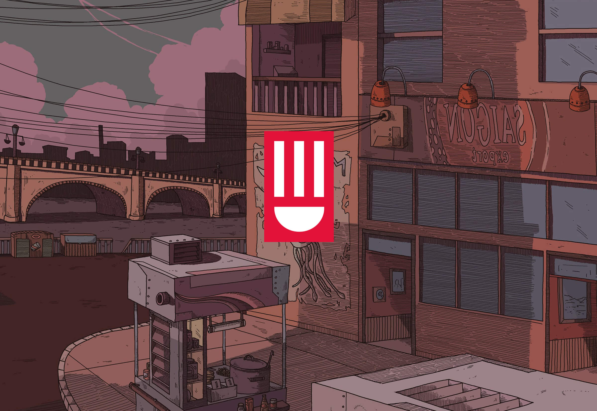
Phở is more than a bowl of soup, it’s an obsession - the soul of a nation. Inspired by the founders’ travels to Vietnam, the website had to occupy the energy and vibrancy of Vietnamese food.
The website feels alive, with interactive animations, load effects, integrated videos and clever use of illustrations to bring depth to the site.
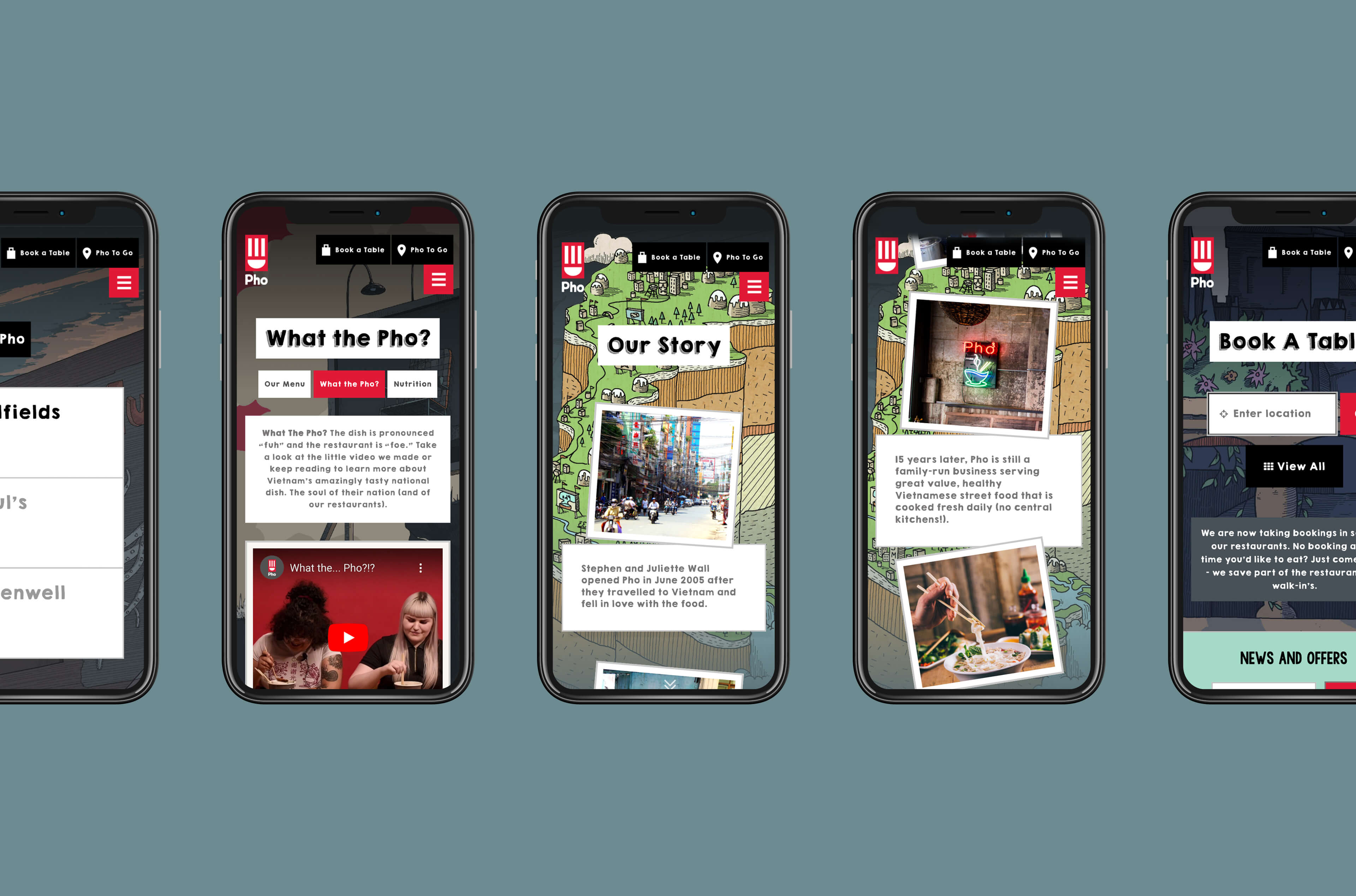
With more restaurant locations, an increased focus on bookings and a wealth of nutritional information to categorise, we needed a slick UX to allow people to find and engage with the content properly.
Thorough keyword research and user-journey planning informed a comprehensive SEO strategy, sitemap and page wireframes. The result - a website that not only looks great but delivers +60% conversions too.
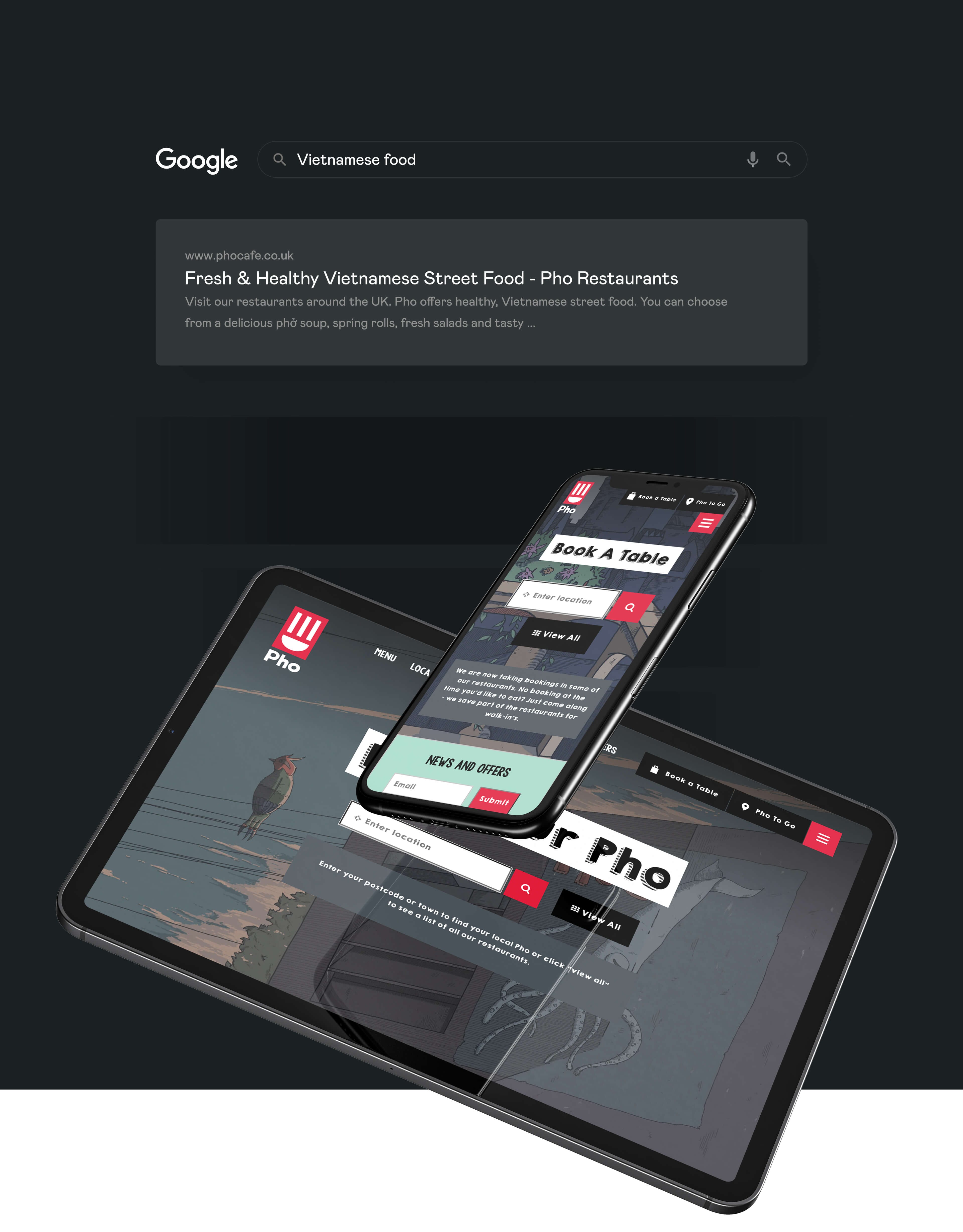
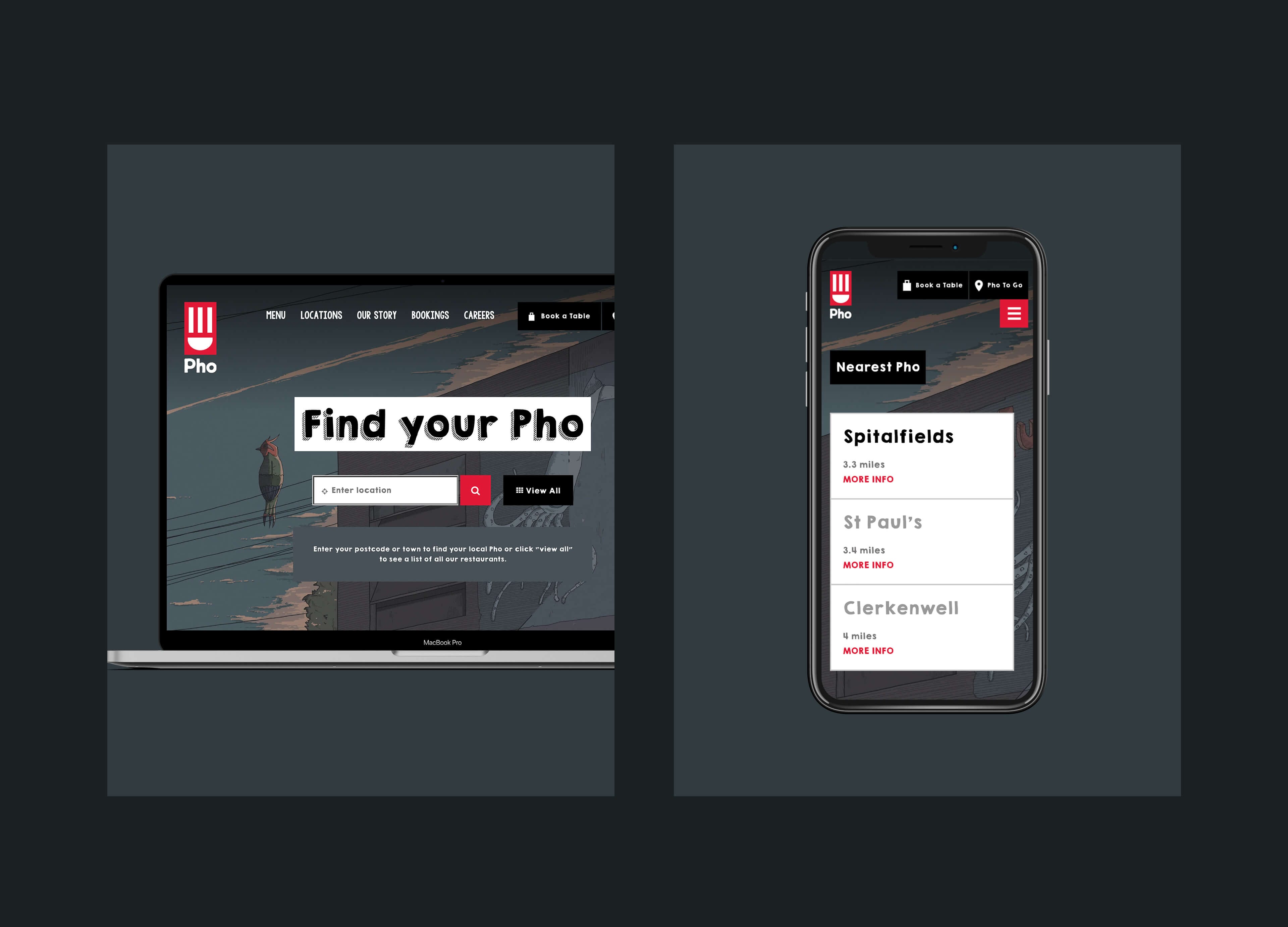
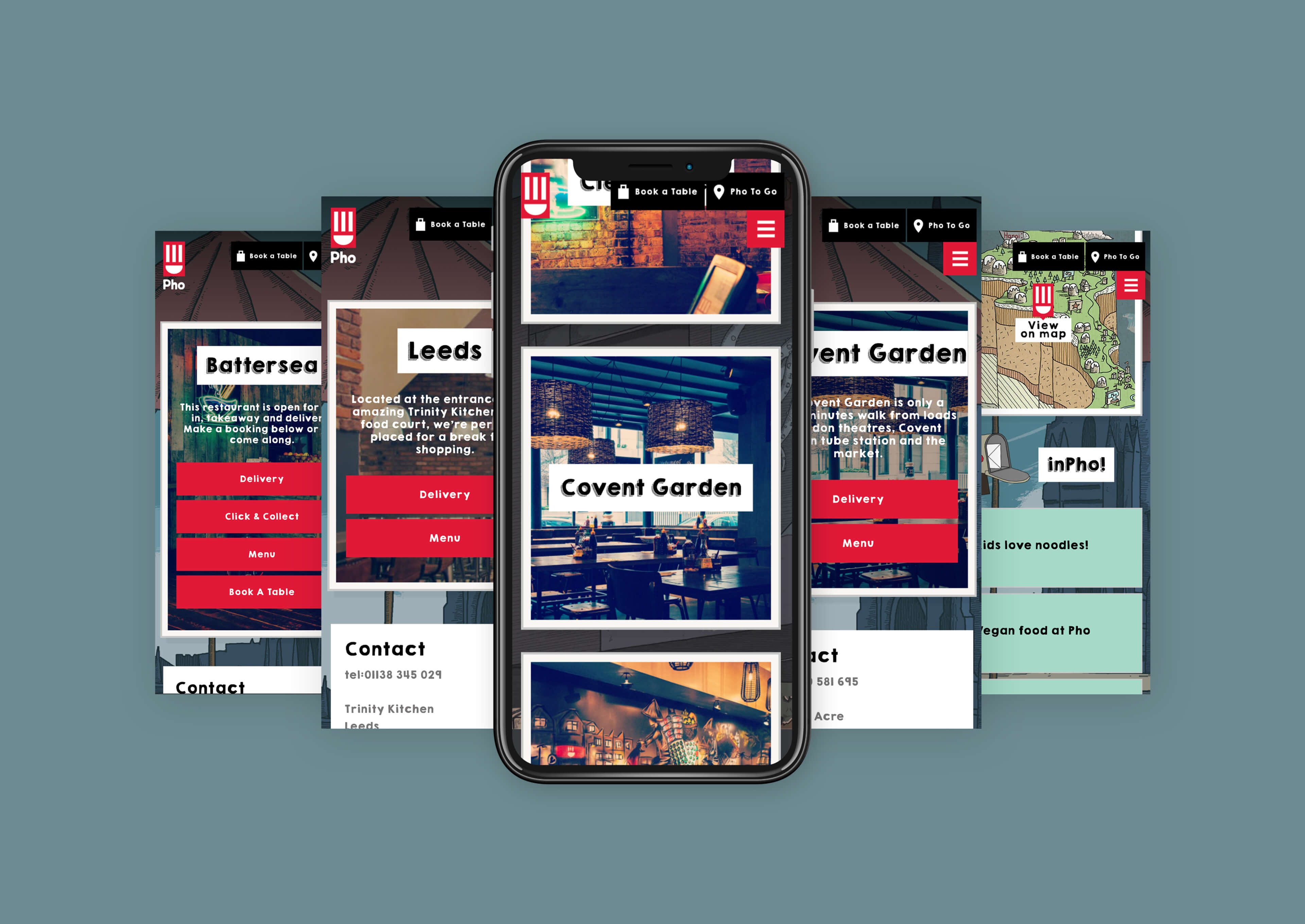
Each restaurant has its own bespoke area, with essential restaurant information featured. Optimised to ensure users looking for their local Pho on Google, find their local Pho - these ‘landing pages’ are websites in their own right.
This localised approach and emphasis on each restaurant is a powerful strategy to combat the issues growing brands face in continuing to reflect the independent nature of each of their sites.
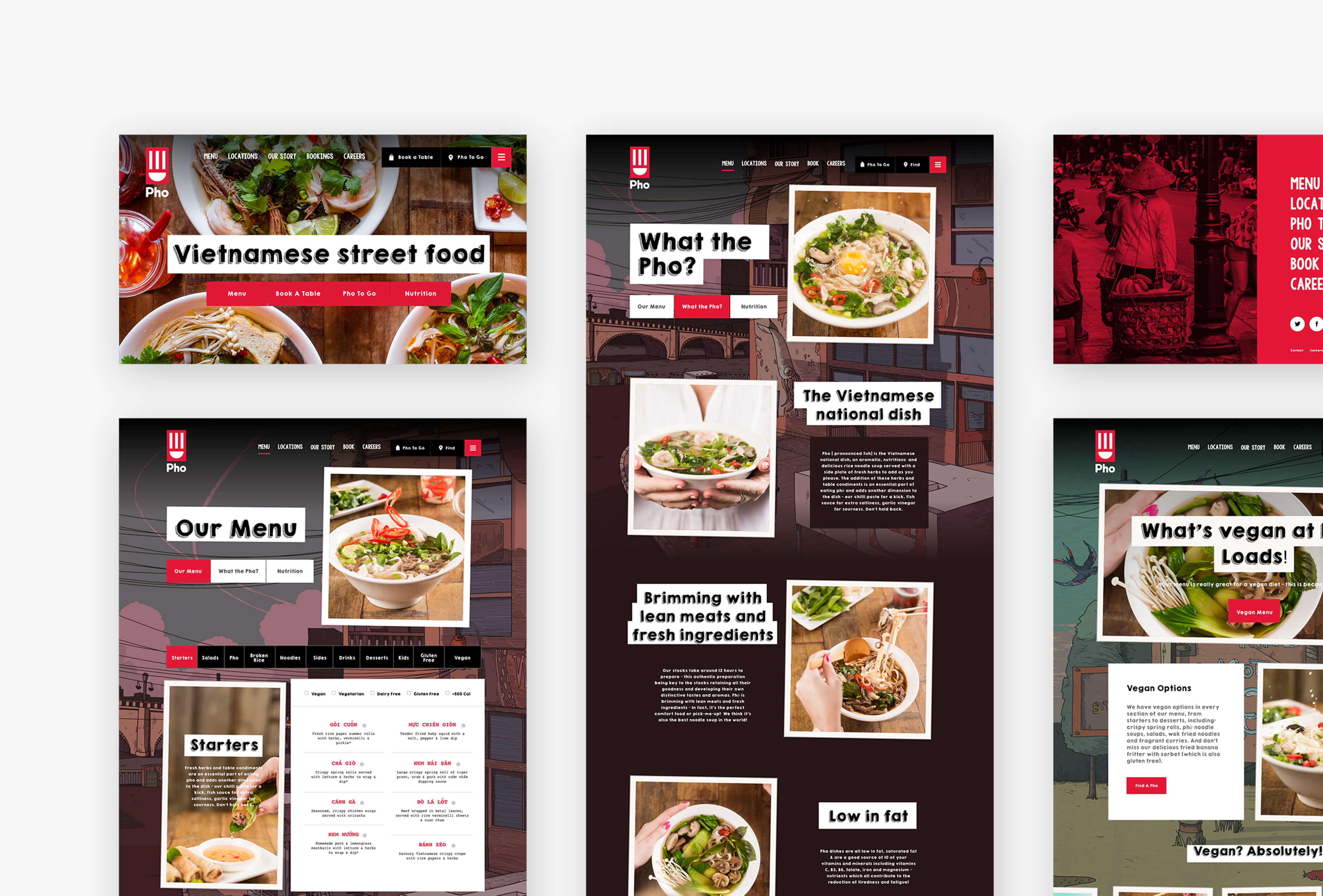
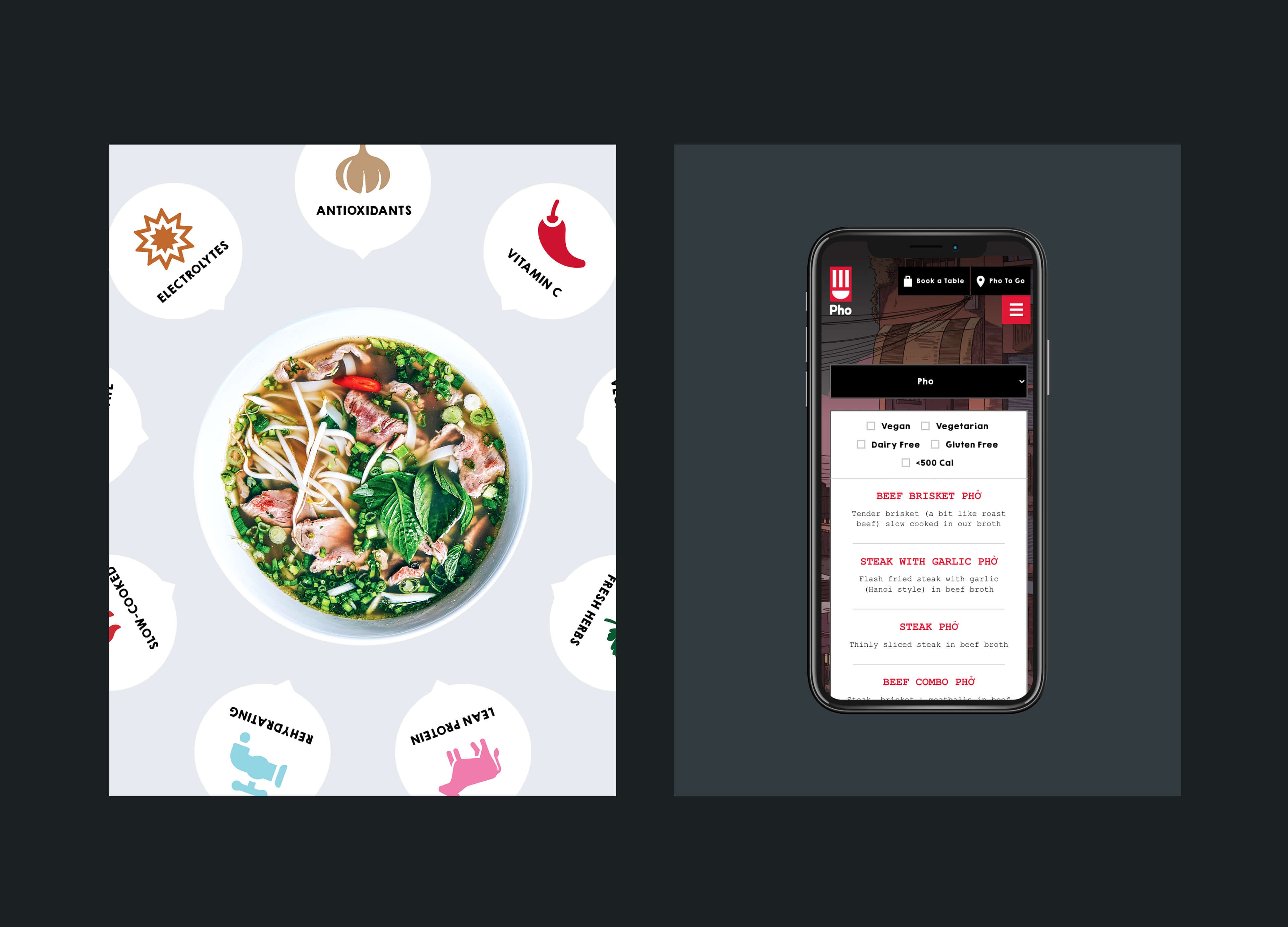
A core feature of any restaurant website is its food. For Pho we developed a bespoke interactive menu that allows users to filter by category as well as food requirements.
With tailored images to each menu category, a clear UX and dedicated pages explaining food types - it has become central to the website and the ongoing marketing strategy.
Conversion Rate
RMI Awards: Best New Website 2018
Related case studies
D&D London
Cafe Murano
What services are you looking for?
Please select a service
Strategy & planning
Website
Marketing
Technology solutions
Branding
CRM
Other
Tell us about your project and what you want from us, this will help us prepare for our call.
What’s your budget?
Please select a budget
Less than £10k
£10-£40k
£40k +
Your Information
Business Type
Location
Please select your location
UK
USA
Europe
Global
How did you hear about Ignite?
I've worked with you previously
Found you online
Recommended by Ignite client or collaborator
Saw an Ignite advert or social
Through Clutch
Other
Tick the box to receive insight, opinion and inspiration from Ignite Spunta la casella per ricevere la newsletter
Please note that by submitting this form you agree to us storing your contact details and contacting you in regard to your query. Our privacy policy is available on our website with full details on our commitment to protecting personal data.
We'll be in touch soon!
Your Information
Tick here if you'd like to receive insight, opinion and inspiration from Ignite Please tick to receive newsletters


Ignite have joined forces with Screen Pilot to form the world's leading marketing agency for the hospitality, travel and leisure markets.
Same team. Same world-class results. Now with more firepower - and the data to back it up.
Head over to our new site to see what’s next. Or call us on 020 7697 0151 to discuss your project.