Mitchells & Butlers
Branding & Strategy
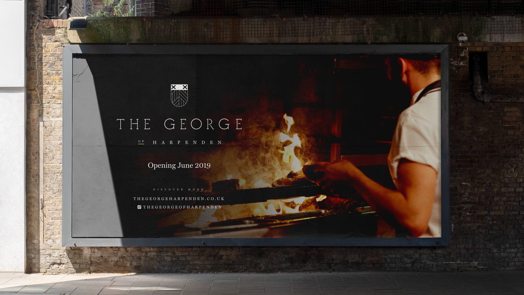
Mitchells & Butlers came to us to help brand and market a new pub chain brand they were launching. Starting with a £1,000,000 refurbishment of Harpenden mainstay 'The George of Harpenden', The George was to become a national pub chain. Offering all-day, high-end food and drink, The George needed to exude sophistication, whilst relating back to its heritage and the town itself. Diners and drinkers both new and old need to feel an affinity with the latest iteration of the pub.
To achieve this, we researched the town's history to create a brand steeped in history, but visualised with a modern twist. The shield element references the Harpenden town crest, re-imagining its elements. This is both synonymous with pub branding and harks back to the origins of the venue’s location. This holds significance as the brief stated the brand must fully immerse itself in the community and for The George to become a hub of the neighbourhood. The wheat-sheaf pattern also hints to the towns plaiting roots, whilst being immediately relevant through its links to beer.
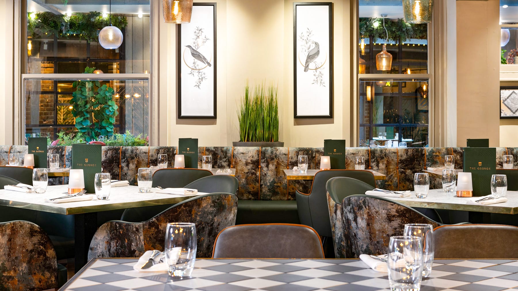
A key aspect of the project was working closely with the interior designers when creating the brand. Ensuring that the physical experience matched the brand was crucial. The location is heavily botanical so colour palette and accompanying illustrations helped ensure the brand is holistic and that on and offline experiences are one and the same. Art directing photoshoots helped to achieve this.
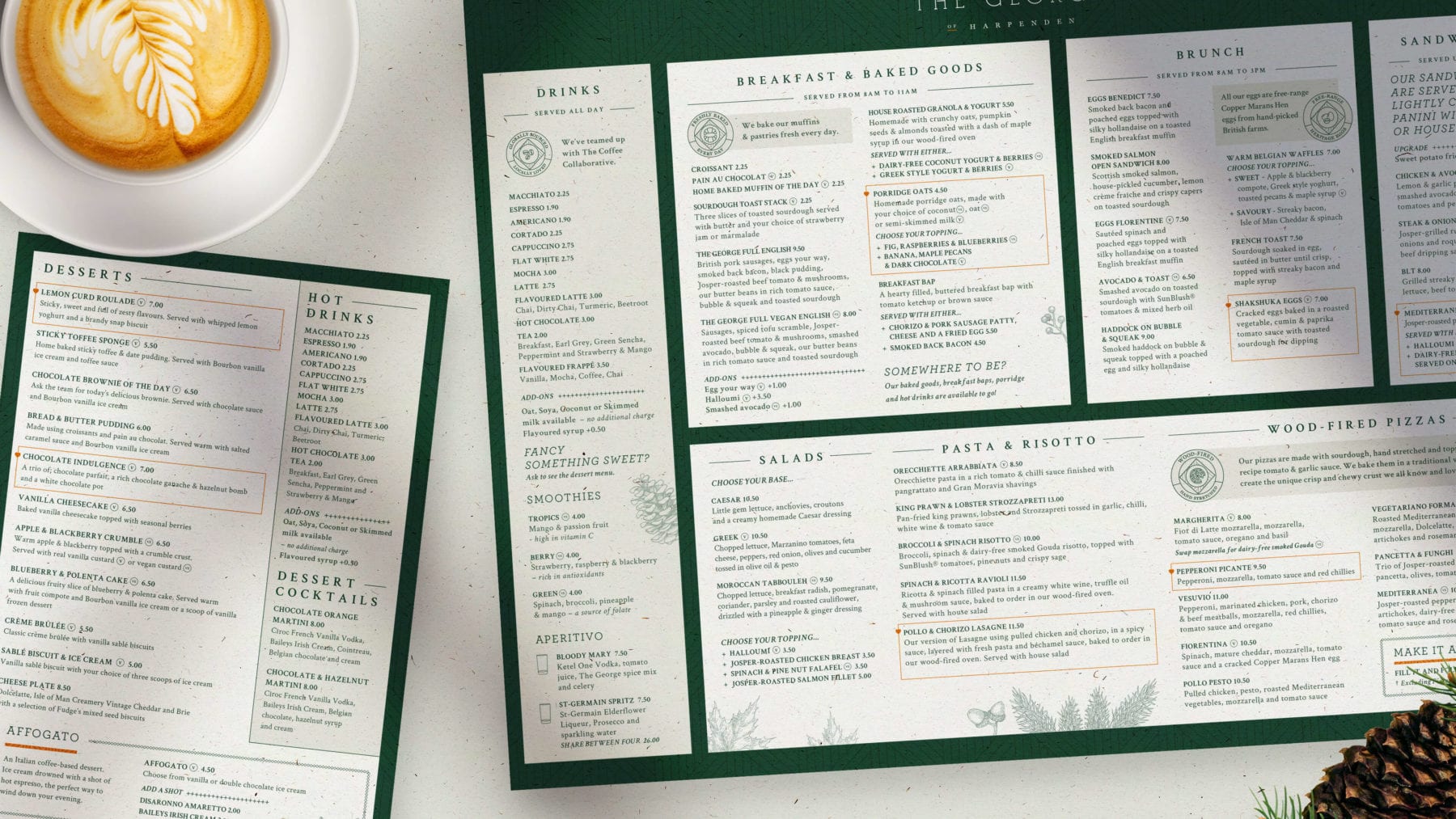
Deliverables included building signage, external hoarding, 6 print and digital menus for both food and drink, POS signage, the re-skinning of their website, social media advertising, email marketing, printed promotional collateral and a full brand guidelines.


Menu psychology was a key factor as, when a location has such a vast offering, All Day menus can be overwhelming for the user. Our strategy team worked closely with the Mitchells and Butlers team to provide clear, considered menus. Each have focussed narratives, composed inline with reading strategies, highlighting hero dishes and drinks in a functional and visually stimulating manner.
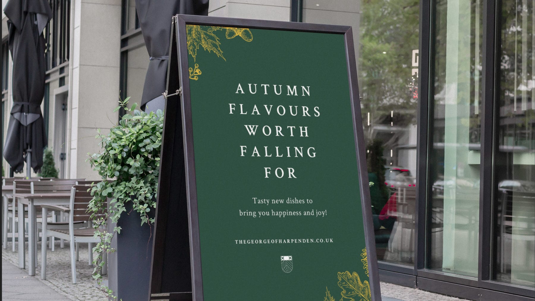
The brand has evolved to rotate its accent colour seasonally. The original yellow is used Spring-Summer, with an emotive burnt orange used for Autumn-Winter. This complimentary change is subtle, but distinct enugh to really highlight seasonal menu changes.
What services are you looking for?
Please select a service
Strategy & planning
Website
Marketing
Technology solutions
Branding
CRM
Other
Tell us about your project and what you want from us, this will help us prepare for our call.
What’s your budget?
Please select a budget
Less than £10k
£10-£40k
£40k +
Your Information
Business Type
Location
Please select your location
UK
USA
Europe
Global
How did you hear about Ignite?
I've worked with you previously
Found you online
Recommended by Ignite client or collaborator
Saw an Ignite advert or social
Through Clutch
Other
Tick the box to receive insight, opinion and inspiration from Ignite Spunta la casella per ricevere la newsletter
Please note that by submitting this form you agree to us storing your contact details and contacting you in regard to your query. Our privacy policy is available on our website with full details on our commitment to protecting personal data.
We'll be in touch soon!
Your Information
Tick here if you'd like to receive insight, opinion and inspiration from Ignite Please tick to receive newsletters

Ignite have joined forces with Screen Pilot to form the world's leading marketing agency for the hospitality, travel and leisure markets.
Same team. Same world-class results. Now with more firepower - and the data to back it up.
Head over to our new site to see what’s next. Or call us on 020 7697 0151 to discuss your project.